Disclaimer: All content on this page, including but not limited to text, graphics, images and other materials, is protected by copywrite laws. You are not allowed to copy, reproduce, distribute, or use any part of this content without the express written consent of the owner of the content. Any unauthorized use of this content may result in legal action.
I'm a UX strategist and UX designer with 5.5 years of experience, working with enterprise and consumer products. My focus areas are UX strategy, user research and experience design. I have experience working with different phases of design and development cycles, by aligning product and UX design with Agile development cycle. I have driven design sprints, UX audits, accessibility audits to help organizations improve their product experience and align it more to standard design techniques.
I collaborate closely with product management team and development team to help organizations discover customer challenges, strategize a delivery plan and continuously deliver designs that enrich the product experience for end-users. I strive at delivering solutions that not only provide good usability, but also make the product accessible. I also have a background in software development, which helps me as a designer to understand technical challenges and work my way around these.
"Shruthy and I worked together at Siemens. Shruthy was in Ux and I was in product management. We worked together on several products, but there is one in particular that stands out in my mind. The product was for a new domain space and presented many challenges - new types of data/information to display, new types of processes, new user personas and so on. Not to mention that we had figure out a lot of things in very short order due to aggressive project schedules. Shruthy handled everything calmly, thoroughly, and professionally. She quickly developed a solid understanding of the system requirements, produced outstanding mockups, gathered feedback from many stakeholders, took input from product management and the development team, and then produced excellent final versions. She earned the respect of everyone that worked with her."
- Mark Homrich, Program Manager, Siemens PLM
"Shruthy Sreepathy was my User Research Intern at Sabre in 2017. She did a wonderful job at getting immersed into the various product teams that she supported. We had her meeting with major clients on her second day. Shruthy participated in design thinking workshops, built personas, created journey maps, performed heuristic inspections, interviewed customers, executed a card sort, built prototypes, and more. Shruthy has a positive mental attitude and communicates very effectively. She has a great sense of humor. Shruthy knows how to set expectations with her clients, co-workers, and managers. She speaks her mind and listens. She is already a great design thinker, who will be a future leader in the UX field"
- Brian Sullivan, Director, Design strategist and researcher, Sabre Corporation
Design Tools
UI Kit Prototyping Axure Adobe Illustrator Adobe Photoshop Adobe XD Figma InVision Miro JAWS, NVDA WAVE accessibility checker HTML, CSS, Javascript
Design Methods
HCI Persona Usability testing Storyboards Ethnography Social Psychology Cognitive Psychology Prototyping Information Architecture SAFe Agile Method Sprint and Scrum
Design Expertise
Service Design Interaction Design UX Strategy and Research UX Audit Accessibility Audit (WCAG) Design Sprint Design Workshop
Nexer Group AB | 2022 - Present UX researcher, UX designer, UX strategist, Design Lead
Modis AB, Client: Siemens PLM Software Ltd | 2019 - 2022 UX researcher, UX designer, UX strategist
Siemens PLM Softwares Ltd, USA | 2018 - 2019 UX researcher, UX designer, UX strategist
ArtSciLab, USA | 2016 - 2018 Usability Testing Lead, UX researcher, Front-end Engineer
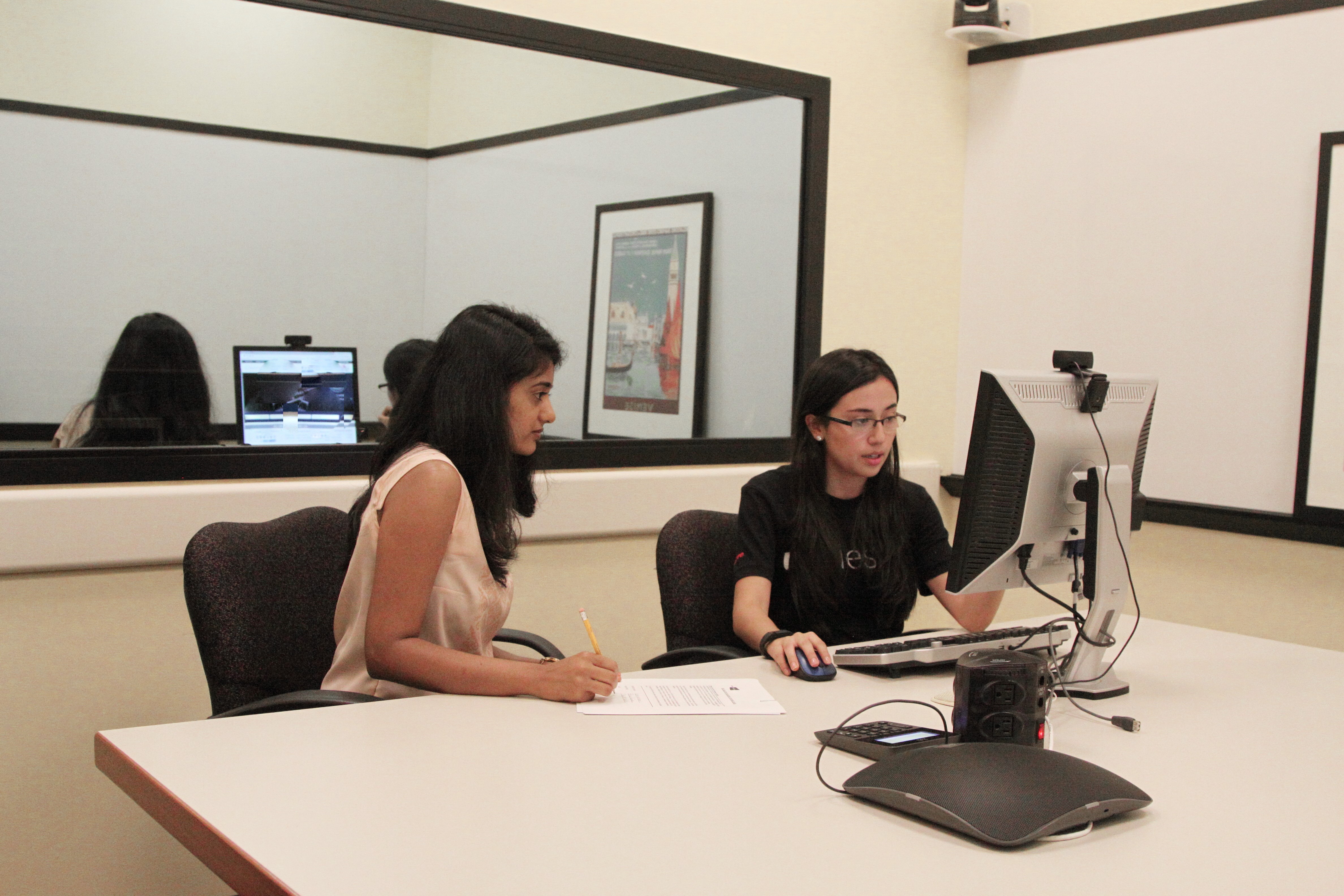
Sabre GLBL Inc, USA | May 2017 - Aug 2017 UX researcher and designer
SAP Labs India Pvt Ltd | 2014-2016 Full Stack Developer, Design Thinker
Women In Engineering IEEE UVCE | 2013-2014 Vice-Chairperson
University of Texas at Dallas 2016 - Present M.Sc specialize in Human-Computer Interaction
Bangalore University 2010-2014 B.E in Computer Science Engineering
I volunteered and made sketchnotes during Big Design Conference 2016 and 2017
I hosted a design workshop at RAW conference 2018 and presented ArtSide at a2ru conference in 2017
At Adobe creative jam 2017, I won first place Judge’s Choice Award for iSHY UX design – theme “The new normal”
I volunteered and presented poster at Grace Hopper Celebration, 2013
I published a paper on data mining “RePID-OK: Spam Detection using Repetitive Pre-processing”, in CUBE 2013
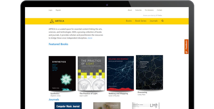
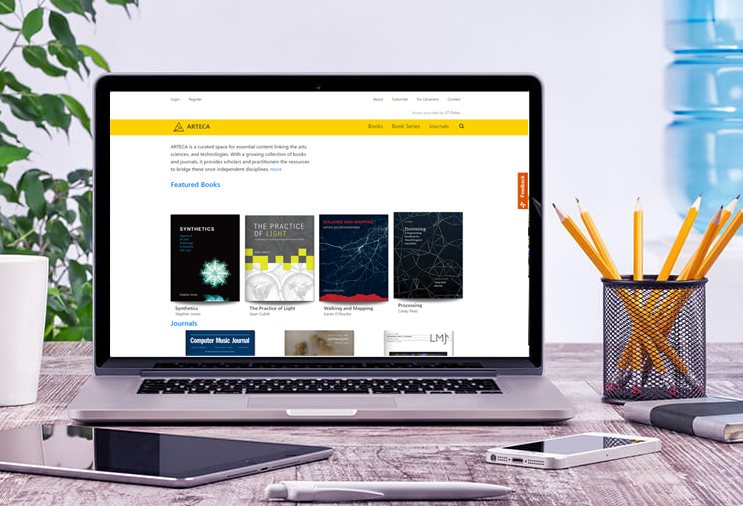
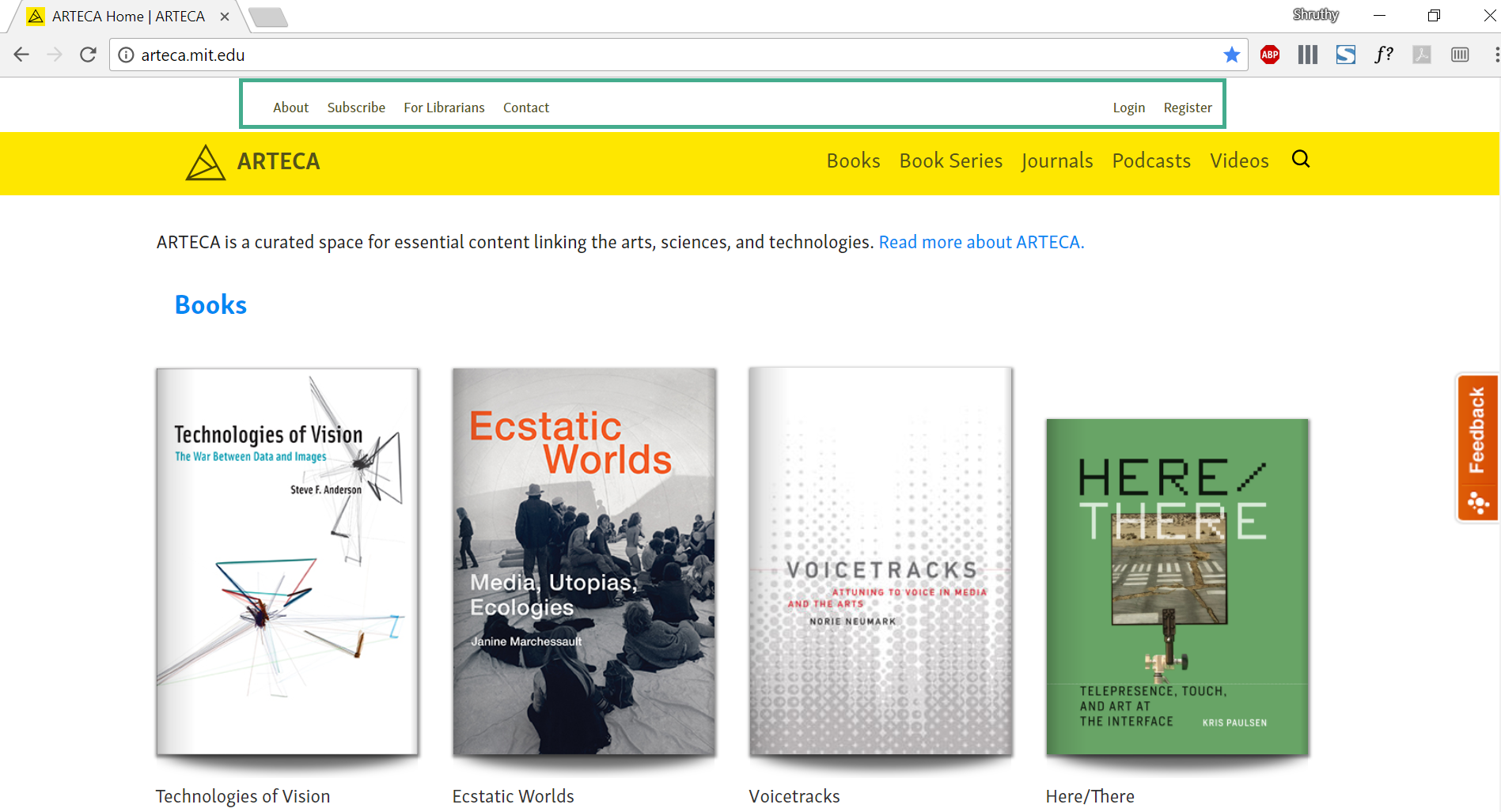
ARTECA is a platform for experimental publishing and a curated space for essential content linking the arts. science and technologies. ARTECA offers a wide range of resources including books, journals, podcast, video, grey literature, multimodal resources, MOOC resources, and community and professional development materials.
Drive one usability test every month Facilitate affinity diagram workshop Conduct heuristic evaluation and accessibility evaluation Identify problems users face with ARTECA website Recommend re-designs to make the website user centric Use Google Analytics to study conversion rate and track user behavior Develop front-end using CMS Drupal
Users were less engaged with the website. Adaption and retention rate needed to be improved.
Usability Test
I have driven 6 usability tests and for every usability test I have a goal defined. I identify a set of tasks for users. These tasks help us get some insights about users experience with the website. I learned to be curious and ask follow-up questions. I learned to ask participants unbiased questions on the go about their choices.
Analyzing data
Observations and Insights
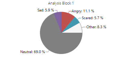
Face Reader
I studied the participants emotions using Noldus face reader software. This helped me understood what emotions participants felt while interacting with the website. Participant was angry 11% of the time while using the website and scared almost 6% of the time. This could mean that the user is not feeling happy or confident while using ARTECA.
Heuristic Evaluation
I followed Dr. David Travis’s 247 web usability guidelines.Out of 247, 42 guidelines did not apply to our website functionality. From the remaining 205 guidelines we identified 25 problems with respect to search feature, website navigation, forms, error handling and ARTECA homepage.
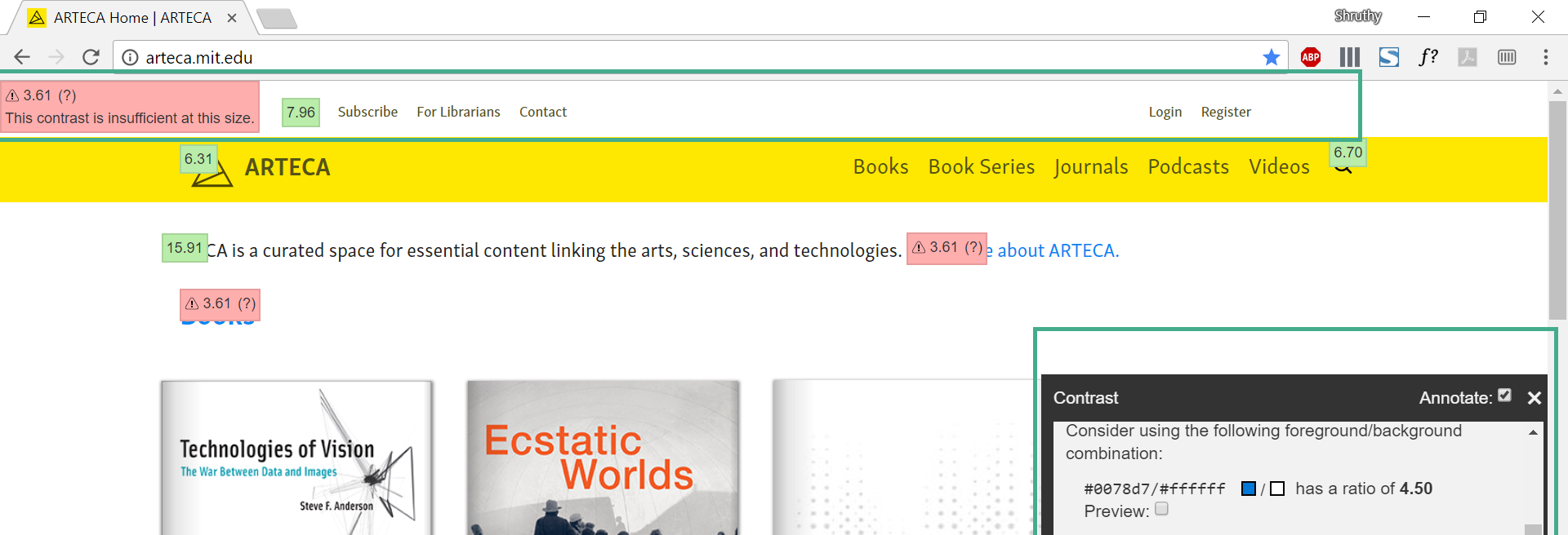
Accessibility Evaluation
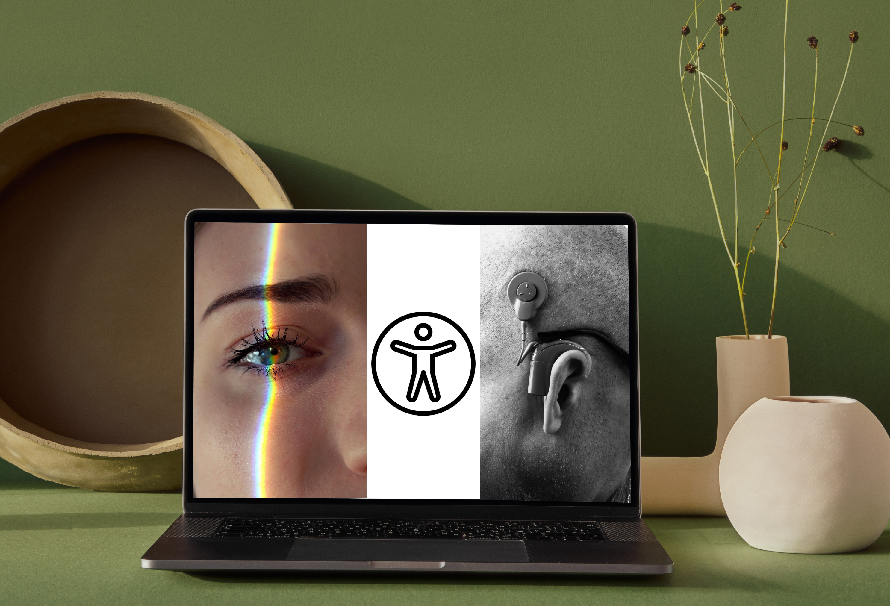
I have evaluated the website with tota11y and JAWS tools, and I found 5 accessibility issues. It gave me an exposure to understand the difficulties visually challenged users face when the website is not well designed for them.
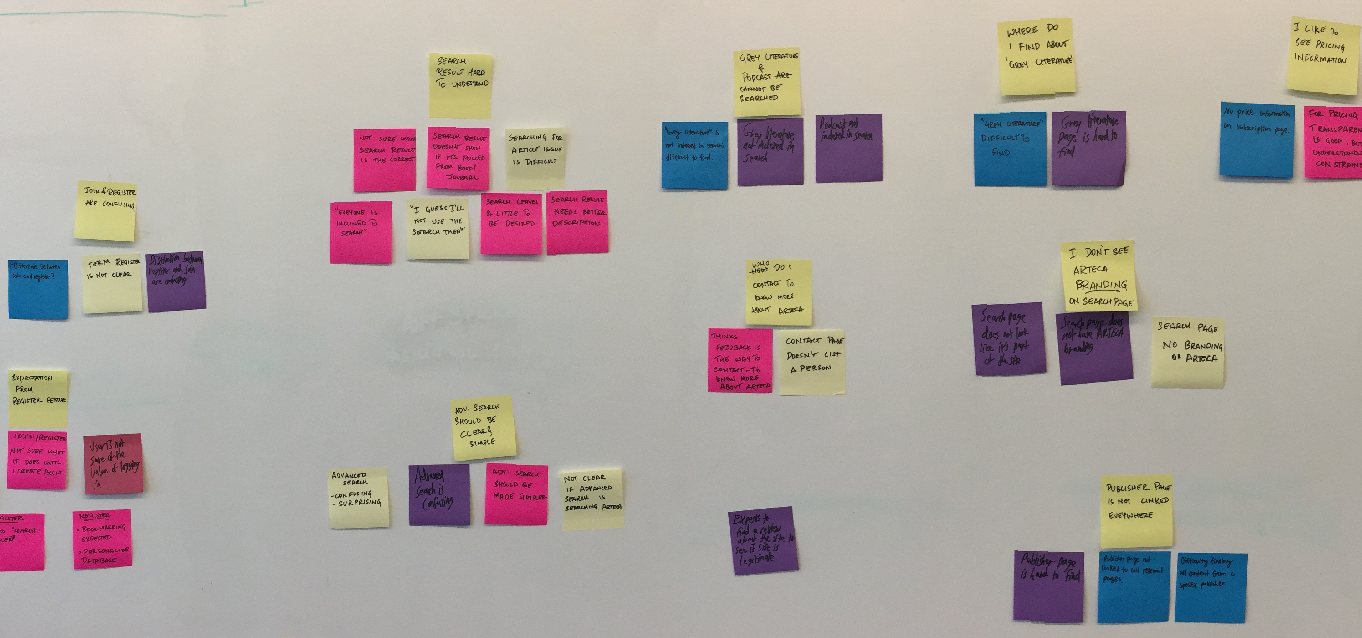
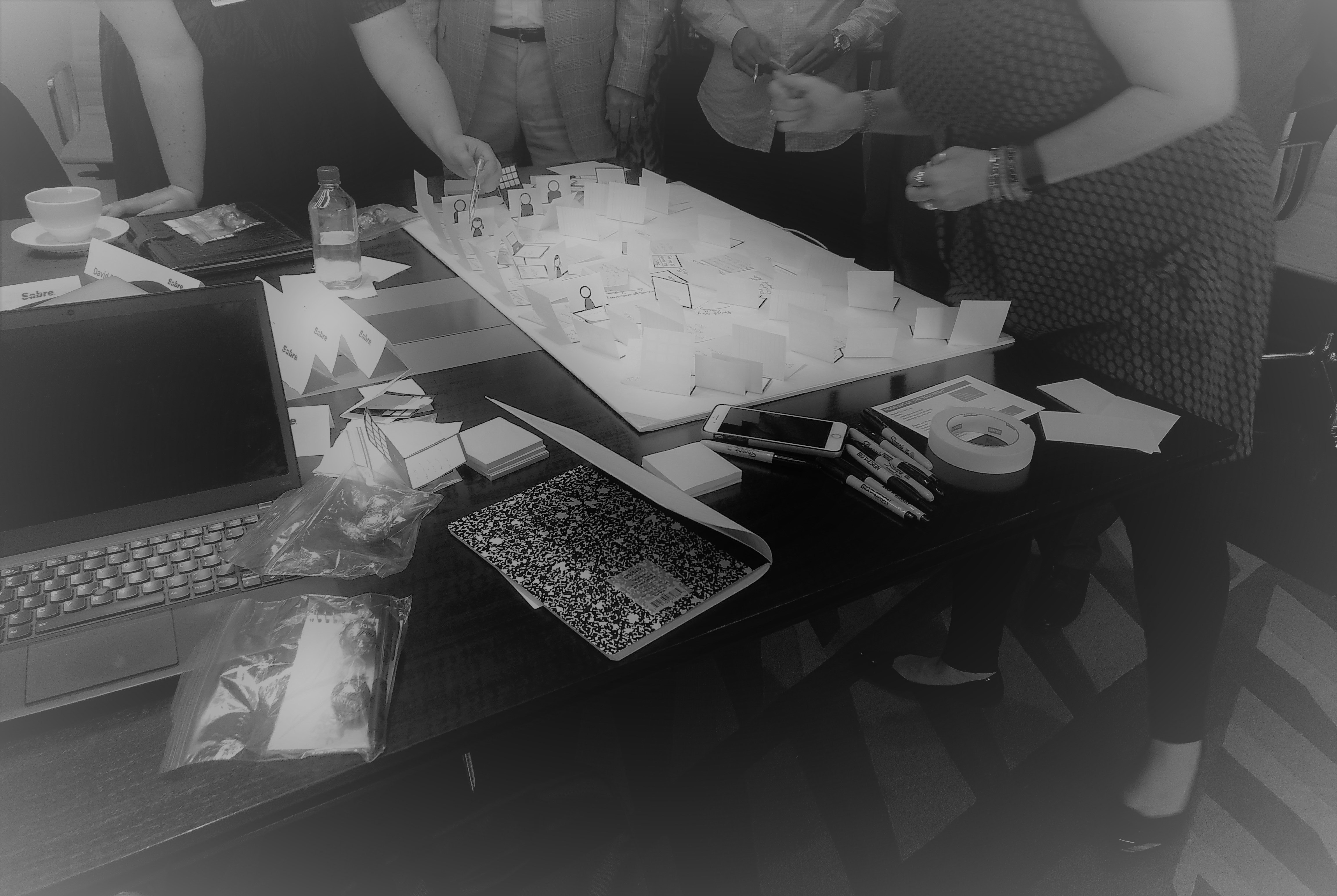
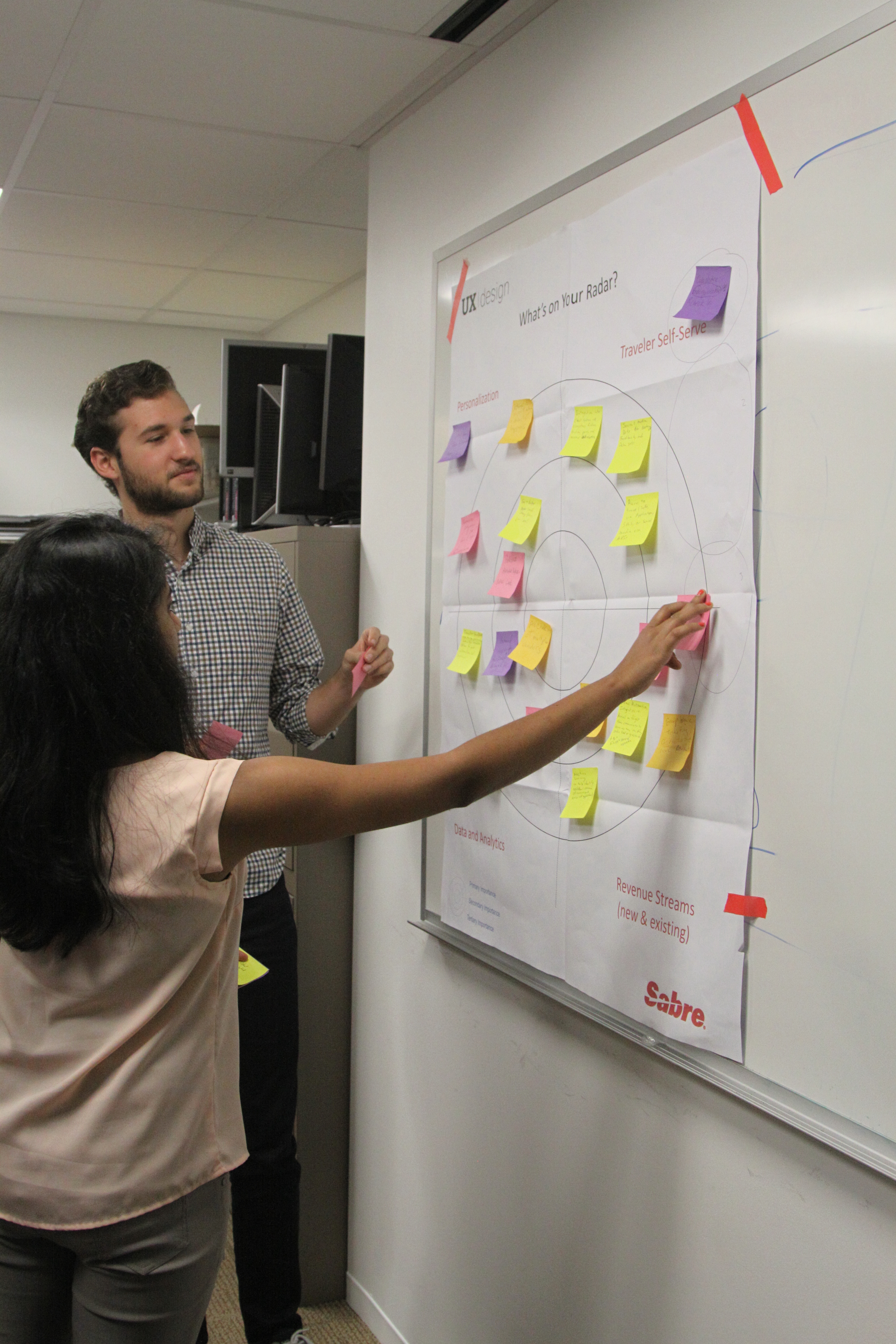
Affinity Diagram Workshop
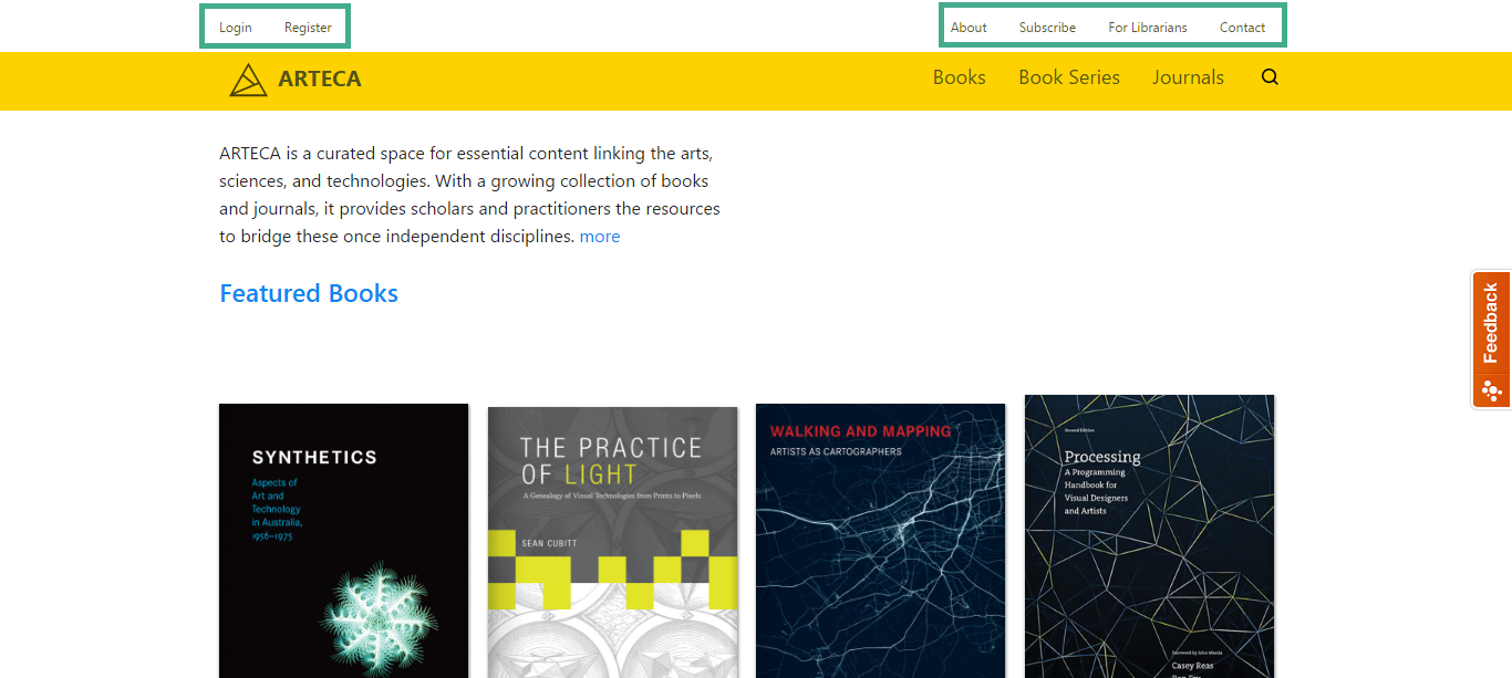
Myself and 2 other team members participated in this workshop to identify pattern in our findings and define the problem. Based on our findings, participants have hard time findings materials on ARTECA. One of the key findings was 67% of the participants found 'subscribe' and 'register' feature to be confusing. 83% of the participants couldn't locate login and register buttons easily. This boils down to one problem - How can we improve discoverability of materials and features on ARTECA?
Prototyping Redesign
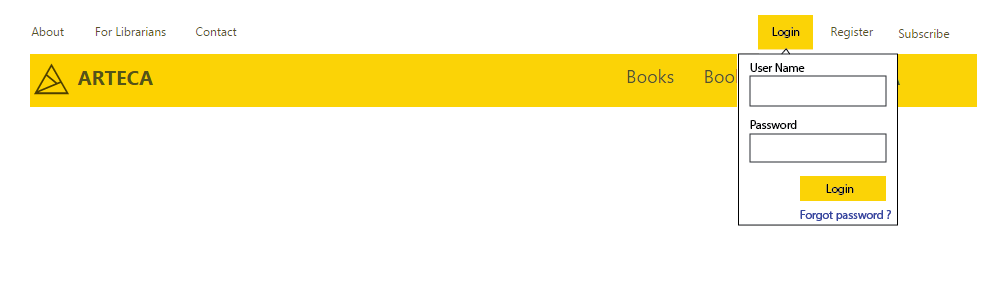
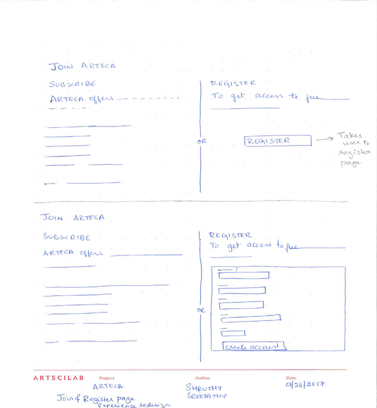
Based on our findings one of the changes made was with respect to the placement of login and register on navigation bar. Below is the new design that was implemented and delivered.
Google Analytics
From Google HEART metrics, I learned a lot about ARTECA user behavior. We saw an improvment in user engagement, and improvement in adaption and retention
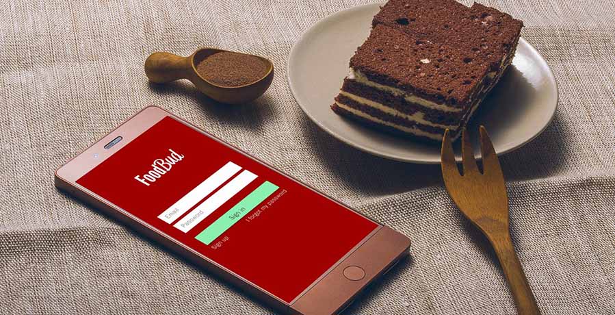
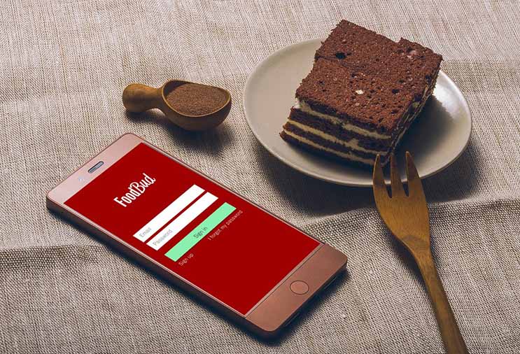
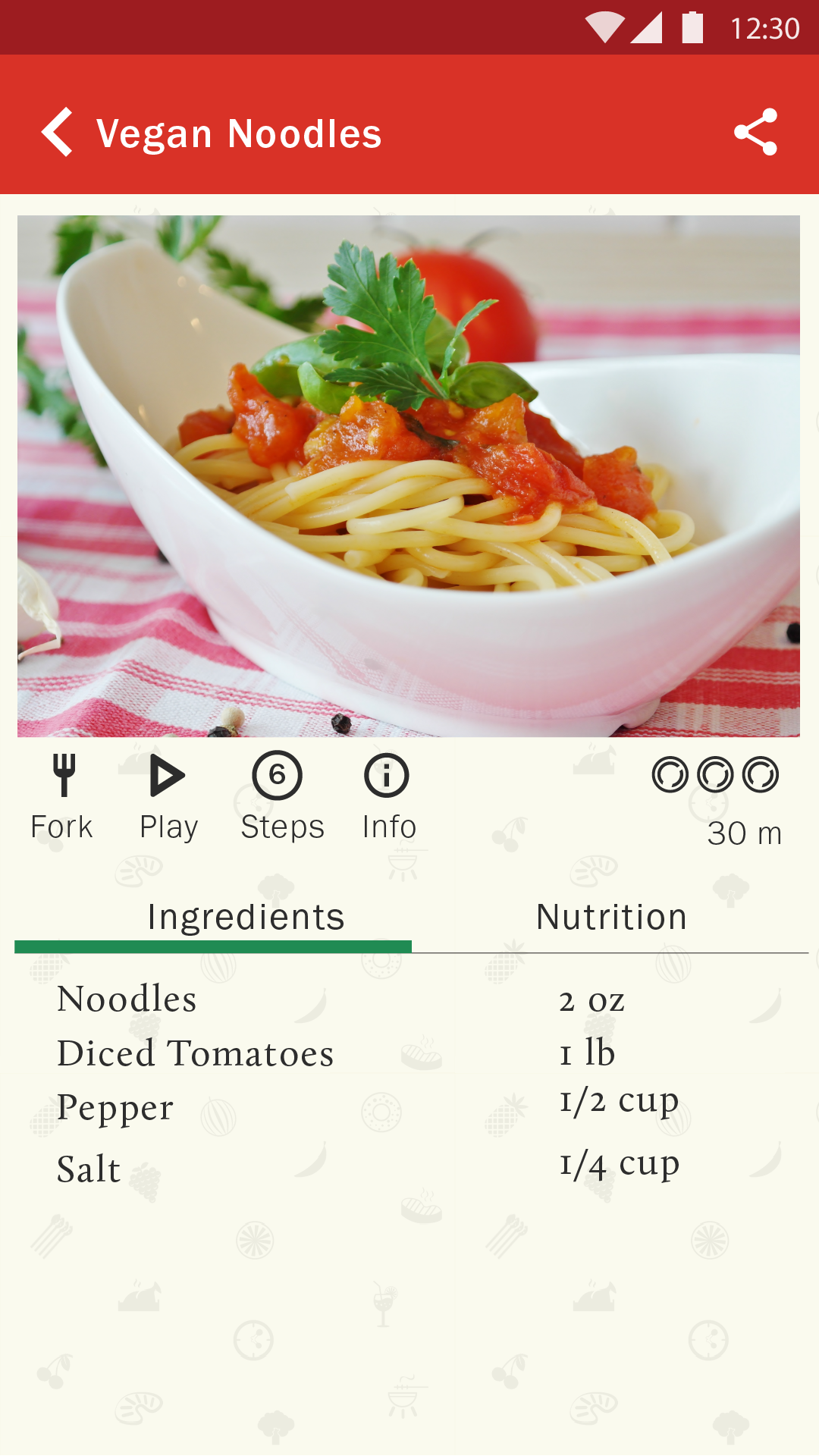
FoodBud is a concept app that was designed to encourage healthy cooking to users who have busy schedule. Most people spend lot of time searching for the right recipe or the right recipe requires them to shop for ingredients. Foodbud app keeps track of items in the user's pantry and recommends recipe based on the ingredients available at home. This saves users time from browsing endless recipes and unfortunately end up eating processed food.
Identify the appropriate research method and come up with a research plan Facilitate affinity diagram workshop Assist team in definiting UI elements Prototype mobile app screens Drive usability study
How to encourage people to prepare healthy meal at home by providing a better cooking experience
Survey
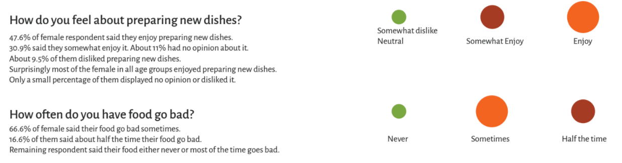
Sent out a survey asking people about their cooking experience, how much time they spend cooking, what they do when they don't have necessary ingredients, what sources they use to learn new recipes and more. Result:
Contextual Inquiry
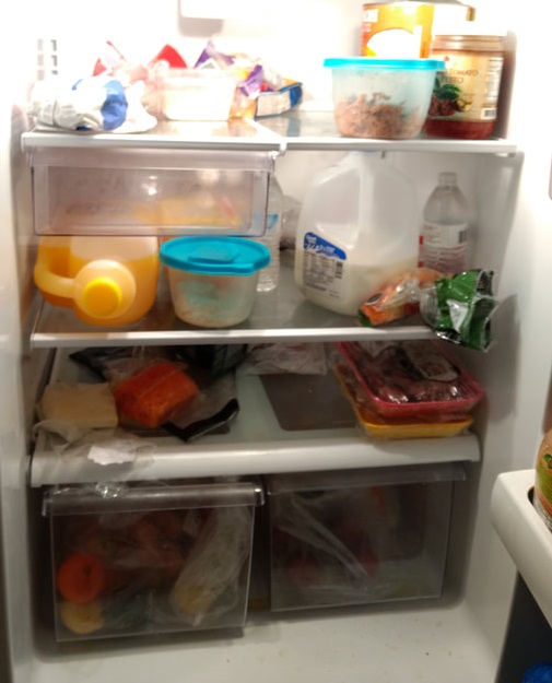
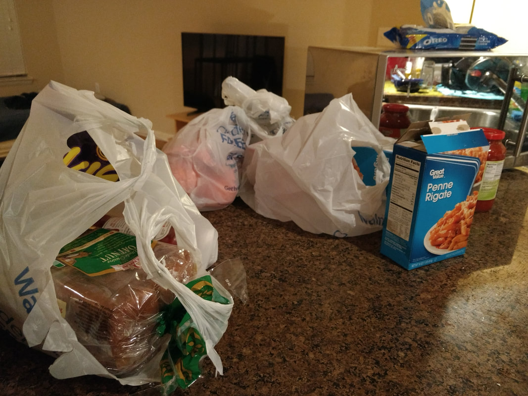
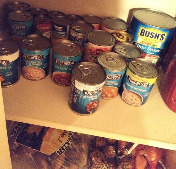
I visited 5 participants home to observe their cooking process. This gave some unique insights into how people go about finding recipes and cooking meals for themselves. Some of the answers, like how important prep time was to users was further emphasized when hearing and seeing how they responded to the question. Results:
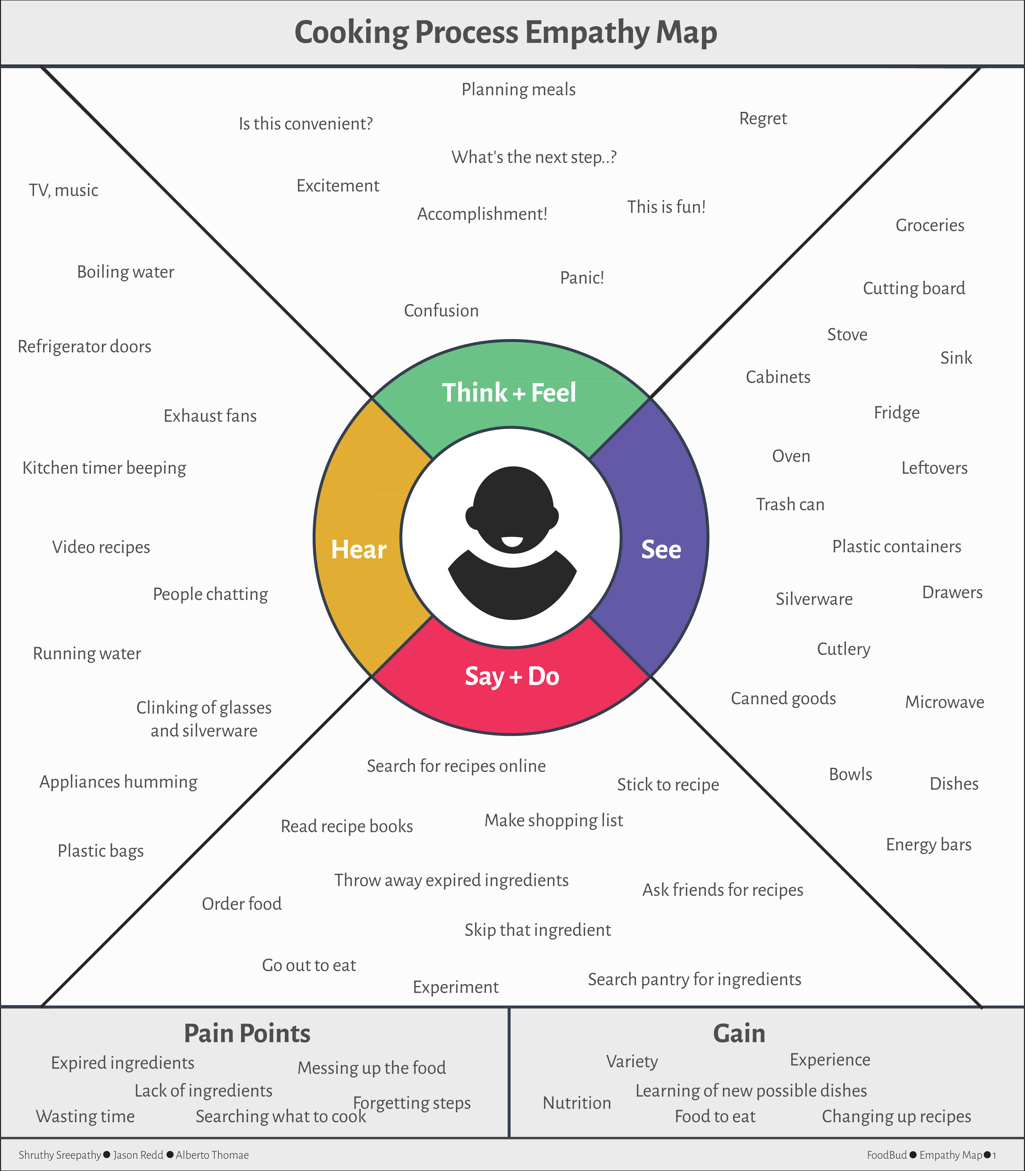
Empathy Map
Based on all the findings we created an empathy map to understand what goes on in their environment
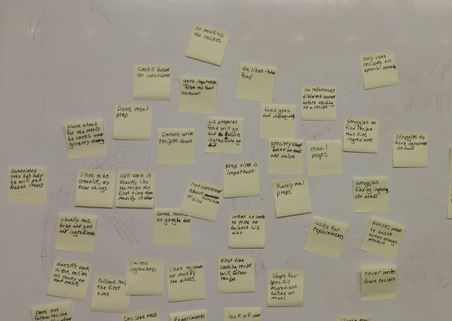
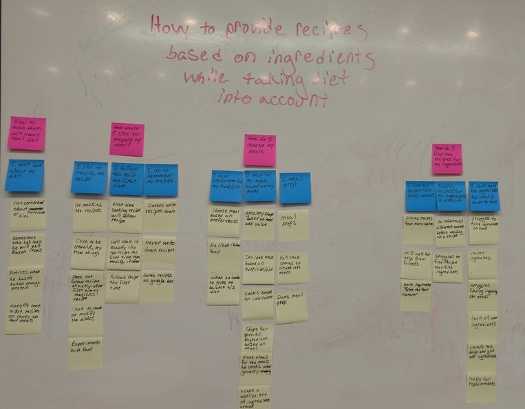
Affinity Diagramming
Gathered data from contextual inquiry and survey, and spread out each point on whiteboard using sticky notes. This activity reinforced our initial idea and expanded our view to additional problems like hygiene factor. On completing this activity we restated our problem statement - "How to provide recipes based on ingredients available in users inventory while taking diet/ hygiene into account?"
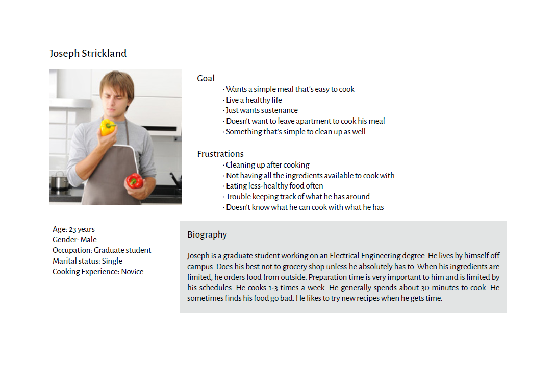
Persona
From the survey results and contextual inquiry data, we made analysis to form three personas based on different age group, cooking experience, cooking habits, number of times they cook in a week, value for family and relation. Based on the survey results we framed their skills, goals, frustrations.
User Journey Map
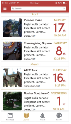
This journey map followed how a current users might go about researching recipes to cook from and the processes of cooking the food while following a recipe. The map took into account Kimberly's (on of the persona) busy schedule and the fact that she had to cook for the family as well. How she might have initial feelings of happiness or enjoyment from doing a certain task that then quickly turns to frustration or anger when that task starts to take more time than initially anticipated because she couldn't find a recipe that fits her inventory. Overall the user journey map has helped identify some potential issues a user might run into currently when trying to research new recipes to cook from.
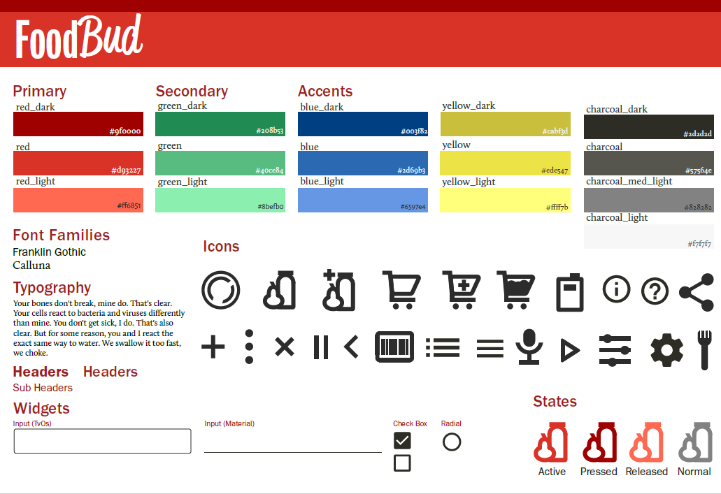
UI Kit
Exploring Android design guidelines, Apple design guidelines and few competitor's app design, my team and I formulated a design language and created a UI kit
Prototyping
With this design language, I did a combination of exploratory and rapid prototyping to design the mobile interface. I translated the low fidelity designs to high fidelity using Adobe Illustrator and marvel app. Click on the links to view the prototype and app video
Usability Testing
I conducted usability testing with four participants and saw relatively similar results with all participants. Users saw the value that FoodBud could bring to them. Test participants could see themselves using FoodBud on a regular basis and they liked the inventory tracking feature. Though they did have some issues with the design language, all four users gave positive feedback on the overall look and feel. Over all FoodBud was acceptable to the participants.
Disclaimer - This was a school project and I was part of a team of three. I led the user research for this project and created mobile interface prototypes by following the design language and UI kit standards my other two teammates designed.
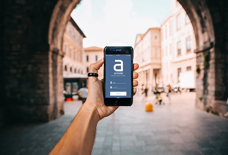
I have been working as a UX researcher with Kuo-Wei Lee on his thesis project ArtSide. ArtSide is an app where public can network and share about their experience with public art.
Journal is an app feature where user can write about their experience with public art, add images/videos and share it with others. This feature was designed in a conventional way how most social media platforms provide. We want to come out of this conventional way of hash tagging, image gallery and selfies. We want to build a space where sharing their experience with public art itself becomes an experience and an opportunity to think and write creatively.
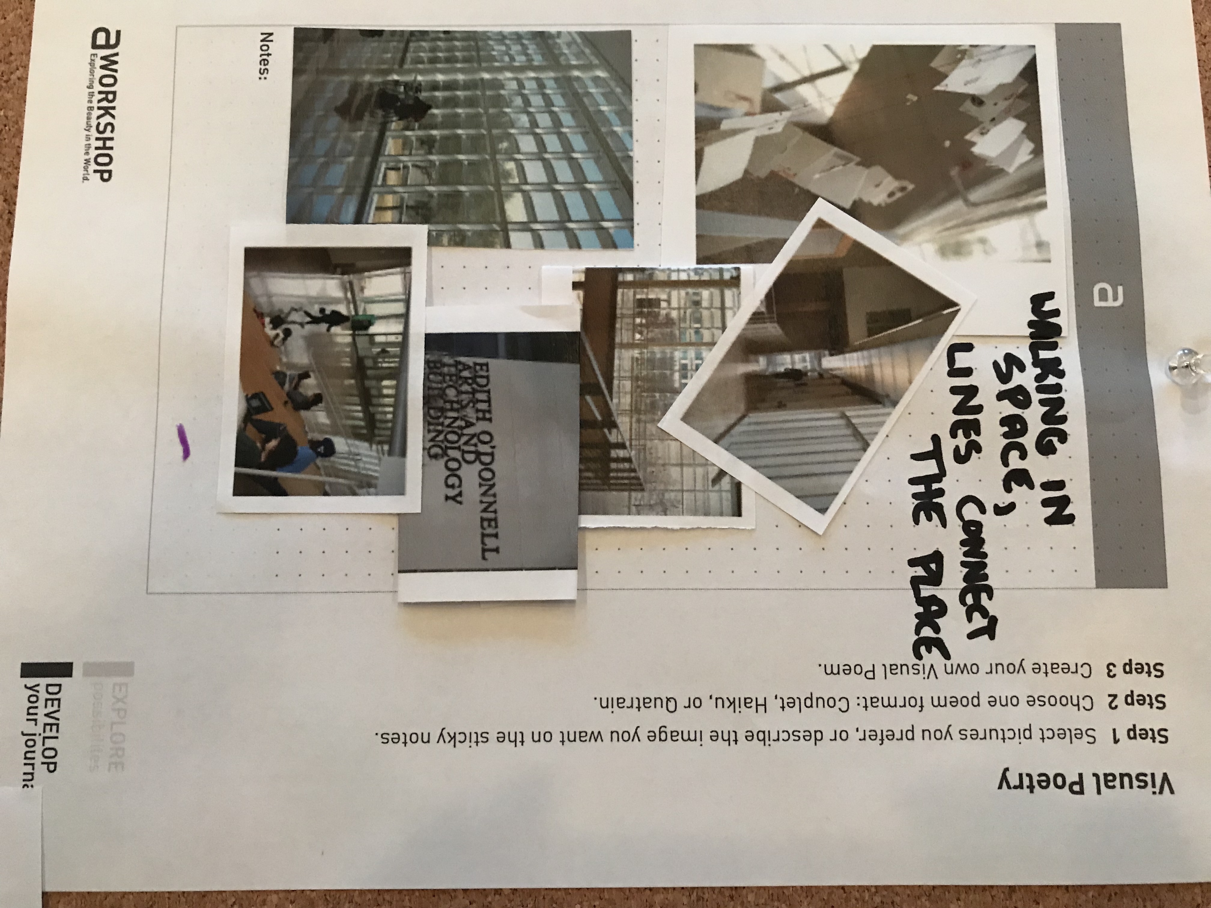
One of the ideas was to use visual poetry as a way for users to express their experience, emotions and involvement with public art.
I conducted multiple usability tests in controlled setup in office and in natural setup the public space. The results showed that the test participants had trouble distinguishing their journal and others journal.
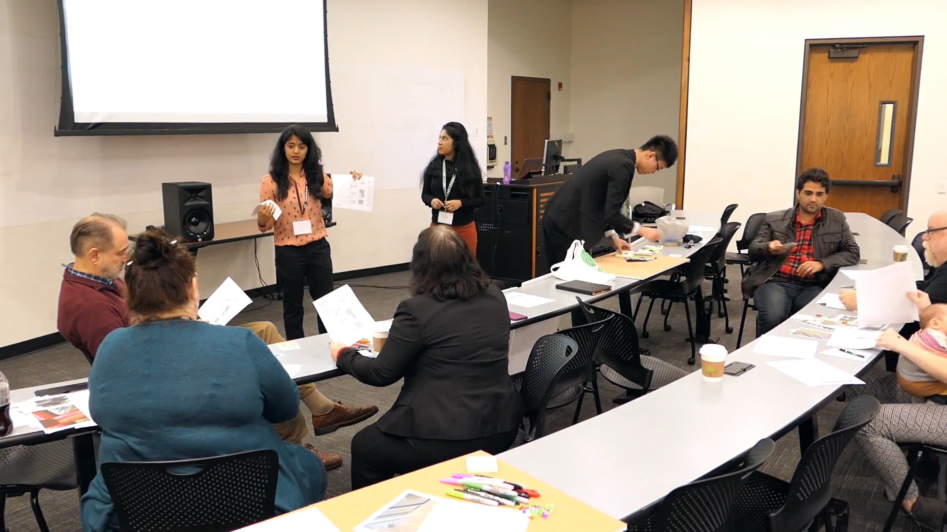
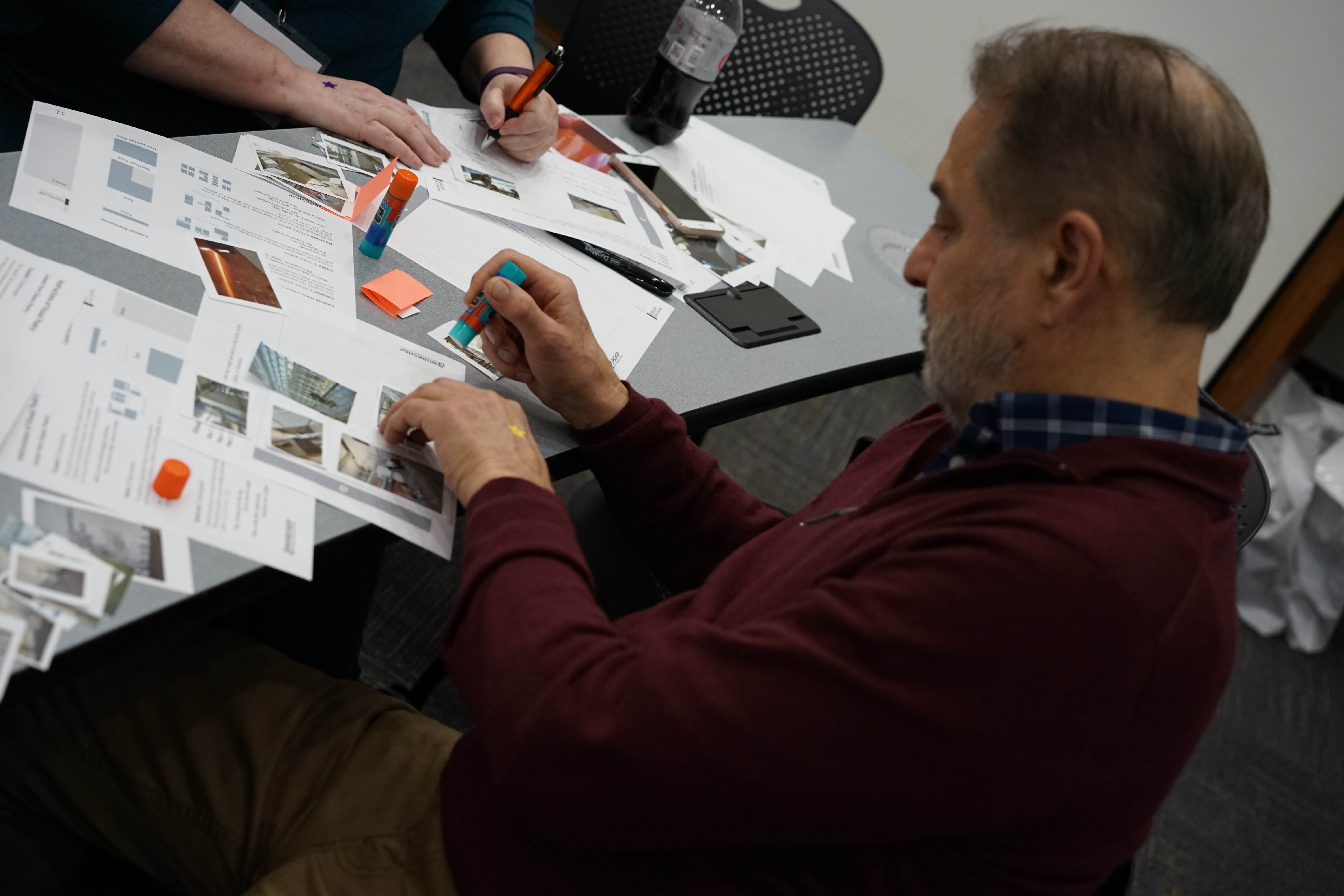
Kuo-Wei Lee, Yusra Khan and I hosted a design workshop at RAW conference in 2018. The goal of the workshop was to ideate and discuss with people interested in arts, on how we can improve the experience of using ArtSide and test the concept of visual poetry in ArtSide.
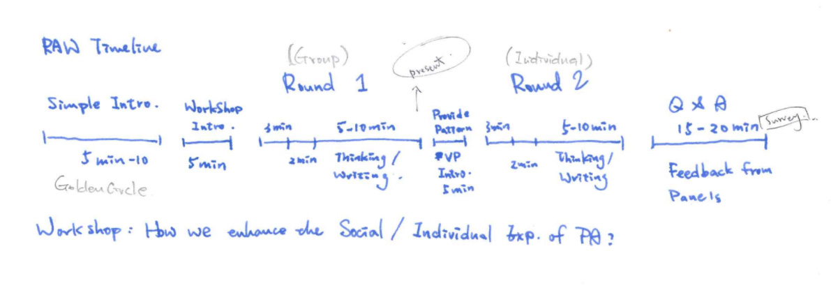
Follow the link to read more about the workshop
I presented the case at a2ru conference with Kuo-Wei Lee and Cassini Nazir
Participants came up with creative ideas. Visual poetry concept was well received by the participants and we received great feedback on how we can improve the design. I got a sense of how people would want to write about their experiences when they wear their creative hats on.
Here's the link to complete record of Artside report
I am improving my skills and practicing better ways to conduct design / research workshops. I have conducted 3 workshops and they have been a great source of learning.
1. It is important to plan, prepare and rehearse ahead of time. 2. Conduct at least one pilot run before the day of workshop. 3. Review your content with people who are not involved in planning the workshop. 4. It is especially important to not bombard participants with lots of information. 5. Be loud and clear. Order of delivery of information is the key. 6. Give the summary of instructions as a handout/ make a slide about it and leave it up on screen while participants are doing the activity. 7. Be prepared with guidelines if participants run out of thoughts / the group discussion deviates from the topic. 8. Give enough time for participants to discuss and reflect on their solutions. 9. Conclude the workshop. This helps participants to understand how their contribution would become part of the solution.
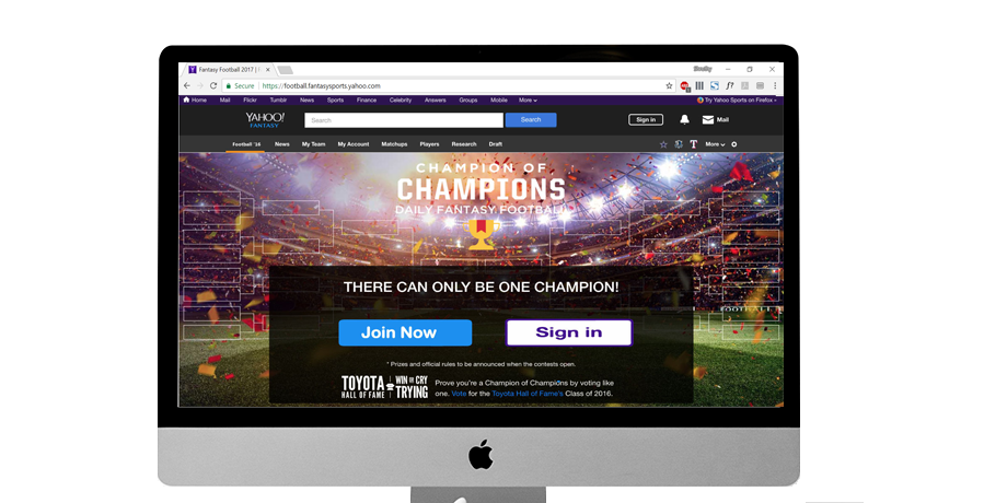
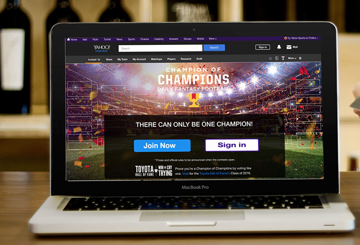
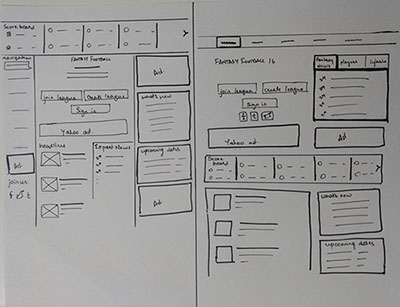
Yahoo! Fantasy Football is a game where you compete against other players to win prizes based on your skill in assembling and managing a fantasy Football teams.
Study Yahoo! history Understand design principles and identify design flaws Redesign Yahoo! Fantasy Football page Collaborate with my team and obtain feedback from other teams about the design choices
Identify where design fails the basic principles and make the design more engaging and satisfying to users.
Background Research
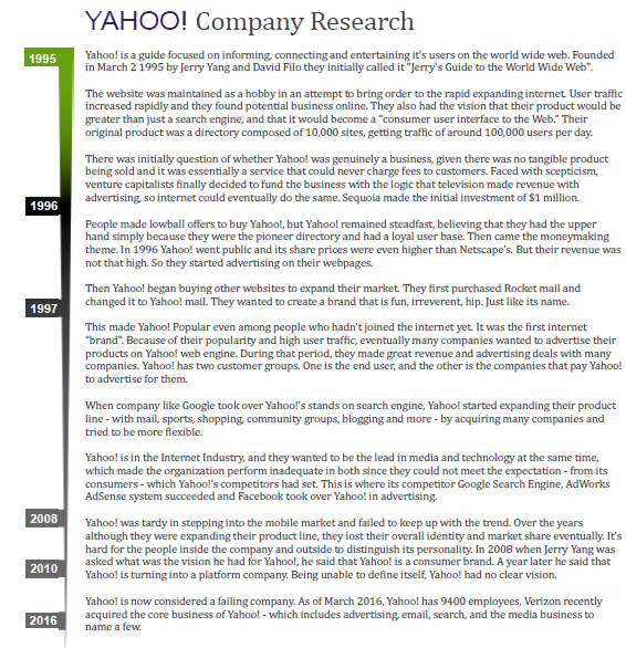
We conducted a brief research on Yahoo! company history to understand how the company evolved over a decade. In this research we found that Yahoo! Fantasy Football stands third in fantasy game and users still prefer using Yahoo! for this purpose. This helped us to narrow down our focus to one of Yahoo!'s popular offering and re-design the website to keep it consistent and improve entry point to the site.
Design Review
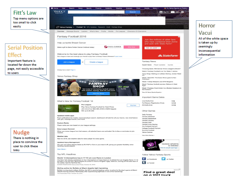
Based on the design principles explained in the Universal Principles of Design by William Lidwell, I identified 25 design violations on Yahoo! Fantasy Football site.
Rapid Prototyping
Prototypes were designed by following 10-plus-10 rule. I improved the design in every iteration by considering the feedback given by other teams.
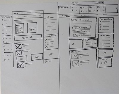
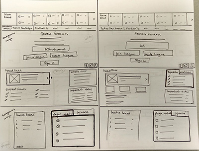
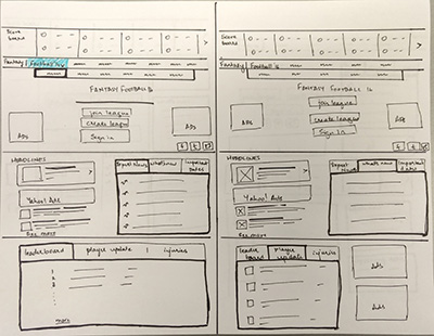
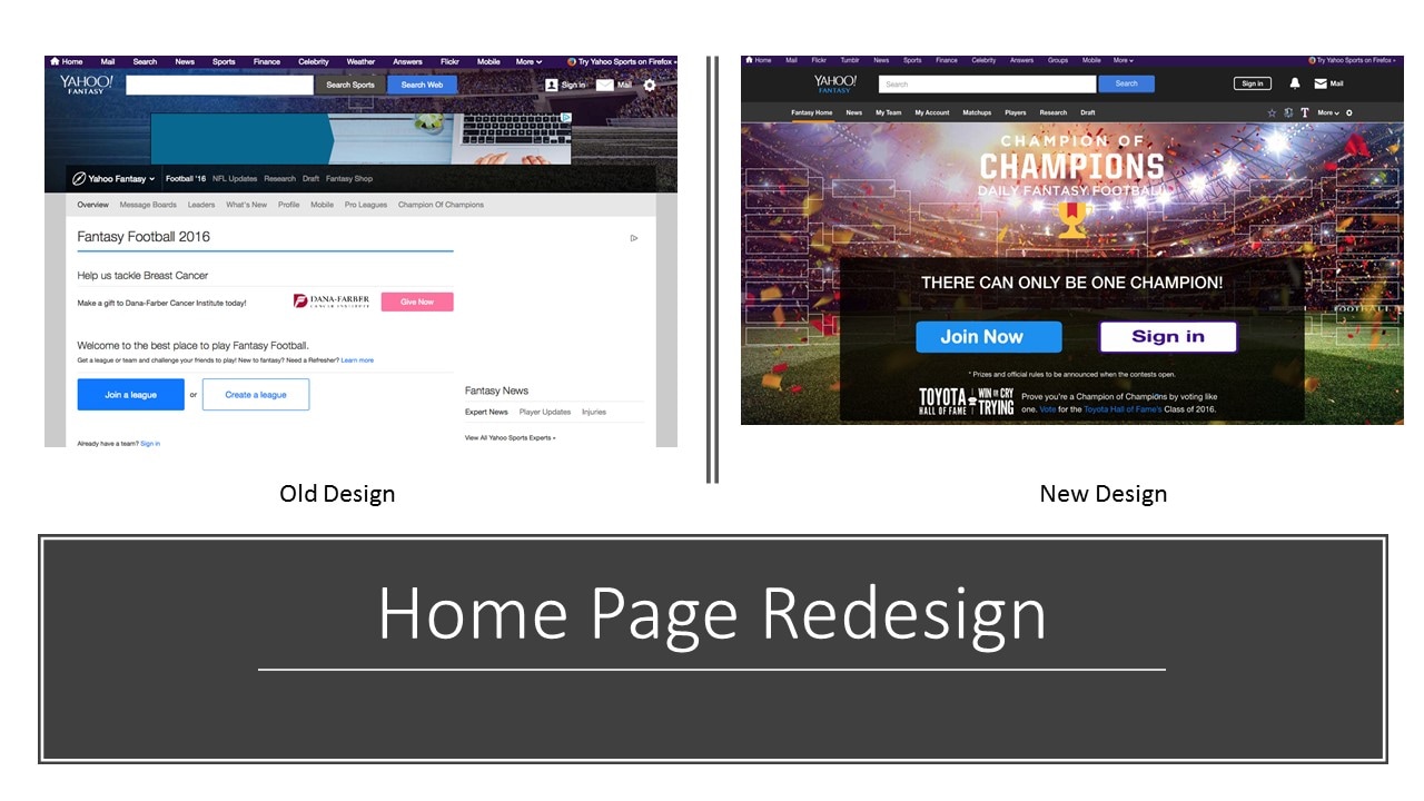
Original design - There is too much negative space and the entry point does not nudge the user to join. It does not give much information to users about the website or why one should invest time and money on Yahoo! fantasy football
New design - The home page before user login, is made more inviting to users. With the image of football ground, it gives context to users and their tag line "There can only be one champion" establishes trust in users.
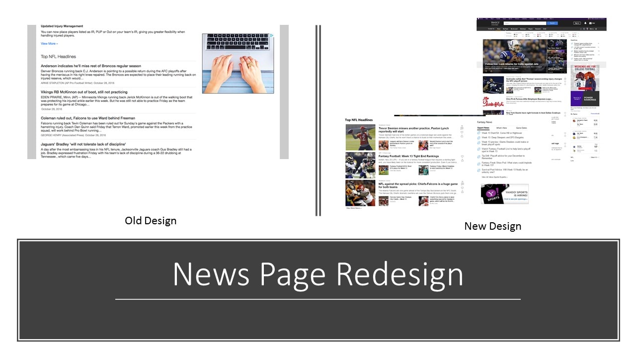
Original design - NFL headlines sections adds cognitive load on users. It is not consistent with Yahoo! news section on Sports page and homepage. Different kinds of news is spread across various parts on fantasy football homepage.
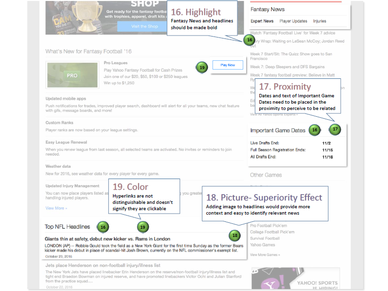
New design - Using picture superiority effect, consistency, highlight principles and using color for hyperlinks, reduces cognitive load on users and the news section was made much easier to scan.
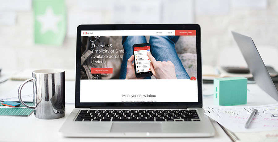
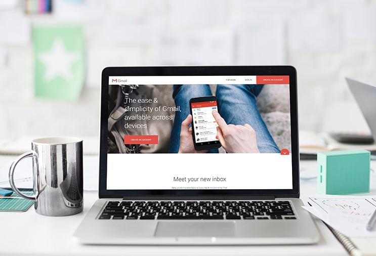
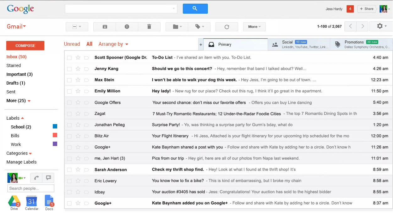
I worked with 2 other graduate students to evaluate desktop version of the Gmail inbox. We conducted user research to understand the problems and redesign the inbox to tackle the key issues.
From our research and findings, we defined a problem statement - how to improve user experience with Gmail web app to make it easier to learn and effectively use the features Gmail offers?
Ethnography
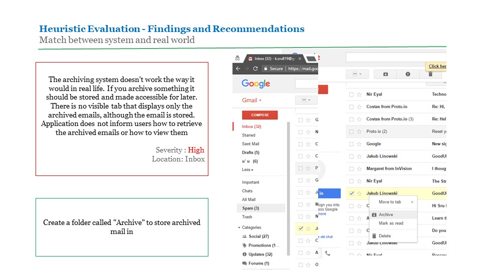
I interviewed 3 Gmail users to talk to them about their usage pattern, painpoints while using Gmail web app. We found that most users knew well to use the basic features gmail offers. When it comes to tasks like archieving and creating labels, people were hesitant. Some people even complained they don't understand where their archives go to.
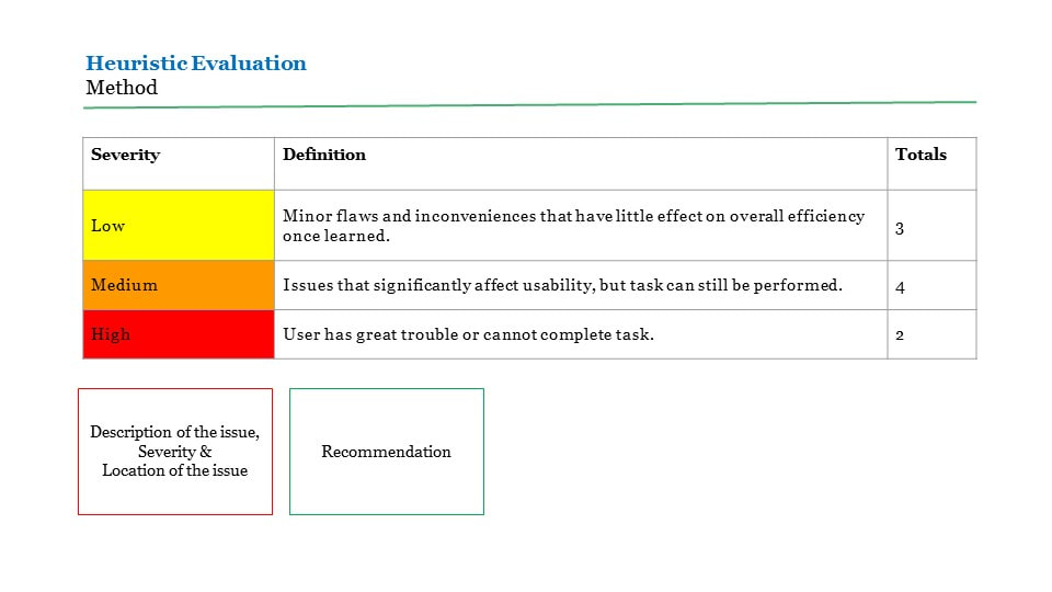
Heuristic Evaluation
I used Nielsen Heuristics heuristic evaluation guideline and identified 9 problems with Gmail web app interface. One of the problems I noticed was that the archieve feature was not in match with users mental model. I identified 2 high and 4 medium severity problems from heuristic evaluation, of which 4 issues was reproducible during usability study.
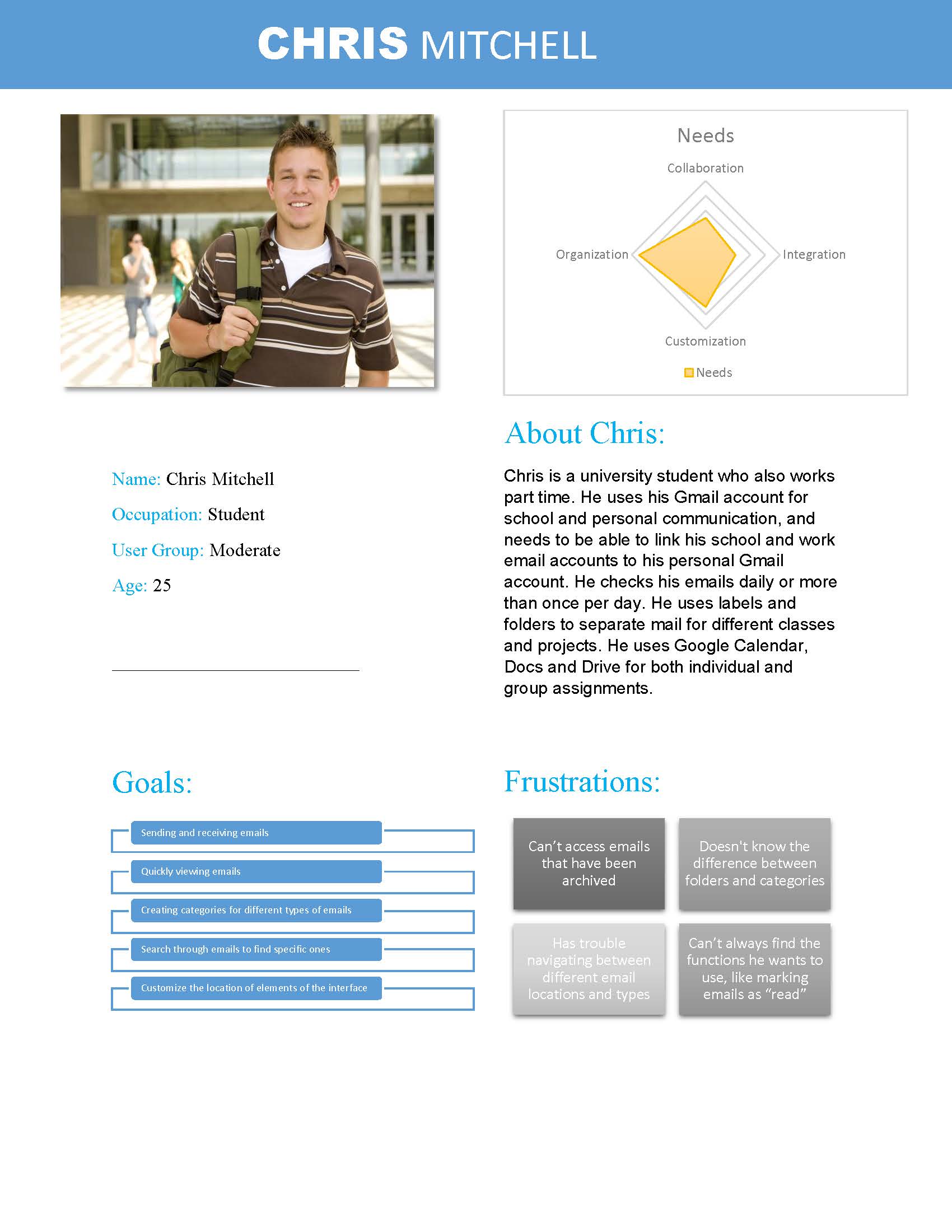
Persona
We identified 3 types of target users based on our research and created personas - casual users, moderate users, extensive users. They can also be classified as business users and personal account users
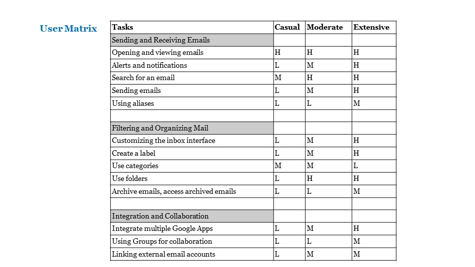
User Matrix
We created a matrix to identify task frequency among all 3 types of users - casual, moderate and extensive users
Protoyping
Each member of the group came up with one design. After evaluating we selected one design and created a hi-fidelity prototype of that.
Usability Testing
We tested our new design and I proctored 2 usability tests out of 4. We discovered 7 key issues with our design.

The goal of this internship was for me to get a broader exposure to all the business units within Sabre, collaborate with design experts to learn and contribute to different products within the company. 1. Work with UX researchers and designer from different Business Units – Travel and Hospitality – and deliver solutions that enable customers to provide complete travel services to their guests 2. Support UX researchers in various UX activities and provide my input 3. Lead user testing and research activities to gather more insights from end users and customers 4. Create design solutions that is smart, simple and cater to user needs 5. Educate UX and development teams on accessibility and the need for it
Enable hotels to focus on a personalized guest services. To do that, hotels need access to information quickly. For example: reservations, housekeeping, guests, and more. The primary vision was to optimise and improve experience of this solution
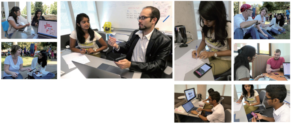
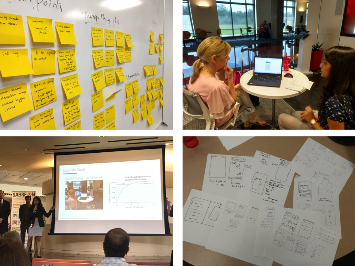
User Research Activities 1. Usability Test a. Conducted multiple baseline usability tests - both moderated and unmoderated using Validately b. I moderated 3 tests and took obesveration notes for the remaining tests. 2. Business Origami Workshop a. Supported a UX researcher in organizing the workshop b. Played the role of a historian during the workshop – by taking photos, capturing the activity, discussions & comments c. Converted the findings from the workshop into a map that identifies - ecosystem, interactions, devices used, pain points and opportunities d. Presented the findings to the UX team and VP
3. Customer Site Visit Visited one of the key customer's site to understand the day in the life of key persona Documented the findings 4. Design Workshop A design workshop was conducted with the client to - a. Understand client requirements b. Translate client’s product vision into screen mockups c. Review design changes
User Research Outcome
1. Uncovered 42 user insights and design recommendations 2. Our key finding was to make data available earlier in check-in flow 3. Redesign solutions for the features, than make users work smarter and faster
I worked with designers from different business units to get a broader understanding of their business, customer needs and provide design inputs to multiple solutions User Research - Participated in user studies to gather more understanding about primary users for GetThere - Created personas for GetThere - Collaborated with designers to derive findings from empathy map session for TripCase
Usability study - Worked with UX researchers from different business units to plan & execute tests - I was the observer and notetaker in multiple studies - Airline Solutions (Recover Manager) and Travel Network (DX, TripCase, GetThere) - Participated in workshops to derive findings from these studies
Improving a travelers experience to tailor to their choices during pre and post flight
This competition required immense knowledge in travelers needs. Working with different business units, enabled me to get a better understanding of users and their needs, and where opportunities lie. Getting the travelers information right when needed was the key motive.
Activities & Outcomes
- Researched about types of travelers and identified our target users
- Did secondary research about target users
- Conducted 4 interviews to create 3 personas –
Business traveler, solo leisure traveler and family leisure traveler
- Created paper prototypes for our case solution
- Conducted a round of Usability study with paper prototypes with 6 participants
- Created screen mockups based on usability study findings
Our case was selected for final round of the competition, where we presented our solution to the VPs and executives at Sabre.
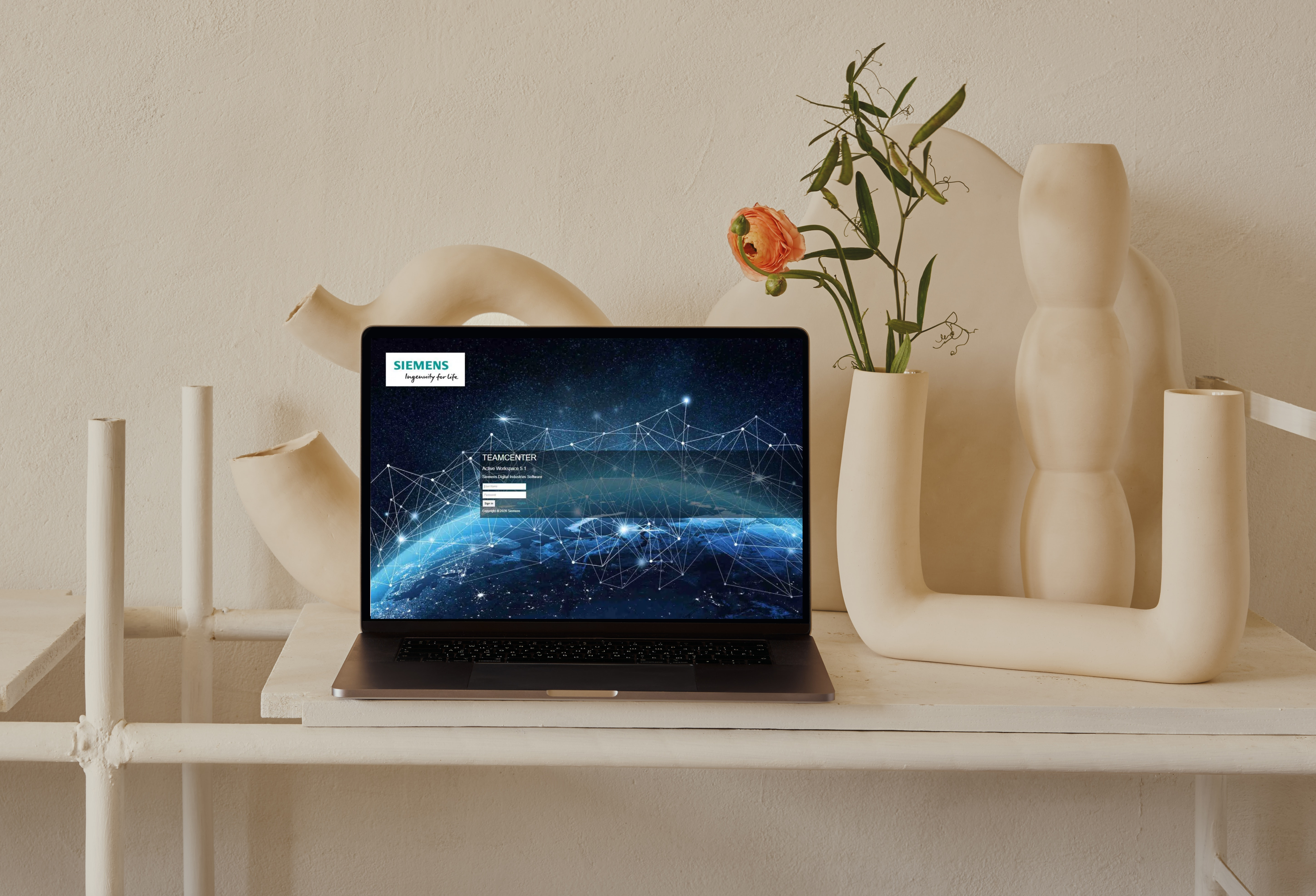
I have contributed in multiple projects on validating the accessibility of their solution(s) against WCAG AA standards and how to make solutions accessible. SAP - Gateway for Microsoft (GMW) I was the accessibilty expert for this solution and I validated against company / WCAG standards to generate a report. Sabre Corporation I gave an educational talk to the other employees on what accessibility is, why it is important, who benefits from it and how to deliver an inclusive solution. Siemens PLM Software Ltd. - Active Workspace I was one of the accessibility lead experts for Active Workspace solution. I customized a guideline (against WCAG AA standards) and testing process that the entire solution team can adapt to. I also educated colleagues on what it is, how to test and fix issues. I designed solutions with accessible navigation for the primary components and pages of Active Workspace. Read more on tools and report on the comformance Report
Contributed in enhancing the experience of program planning and schedule manager on AW. Thus enabling users to work efficiently with less manual effort. - Lead UX designer for Program and Project Management team - Responsible for developing and optimizing the user experience for these solutions - Work collaboratively with product owners, architects and developers to understand user needs and areas for improvement - Work collaboratively with developers and designers to deliver design solutions that are also technically feasible - Conduct user studies and UX research to understand the problem space and get customer input - Conduct user tests to validate that we are solving the users problem - Collaborate design team to deliver standard design patterns, update design guidelines or library.
Creating a project plan, scheduling events and resources can be a tedious manual job. Users want a solution that enable them to efficiently plan projects, events and manage resource allocation.
Facilitate our users in their digital transformation journey and help them get relevant information faster and work smarter.
To see visual design, view the blog post. It shows a video snippet of this feature and other similar features that I optimized the experience for. The main motive was for the solution to be more user friendly and allow users to quickly create a program plan and reschedule events under it.
Disclaimer: To maintain professional integrity, some parts of this case study has been censored or replaced with placeholder content. All content on this page is protected by copywrite laws.
Client: Encare AB
With support from field experts and product team, I mapped the vision, goals and defined a roadmap plan for EIAS 5.
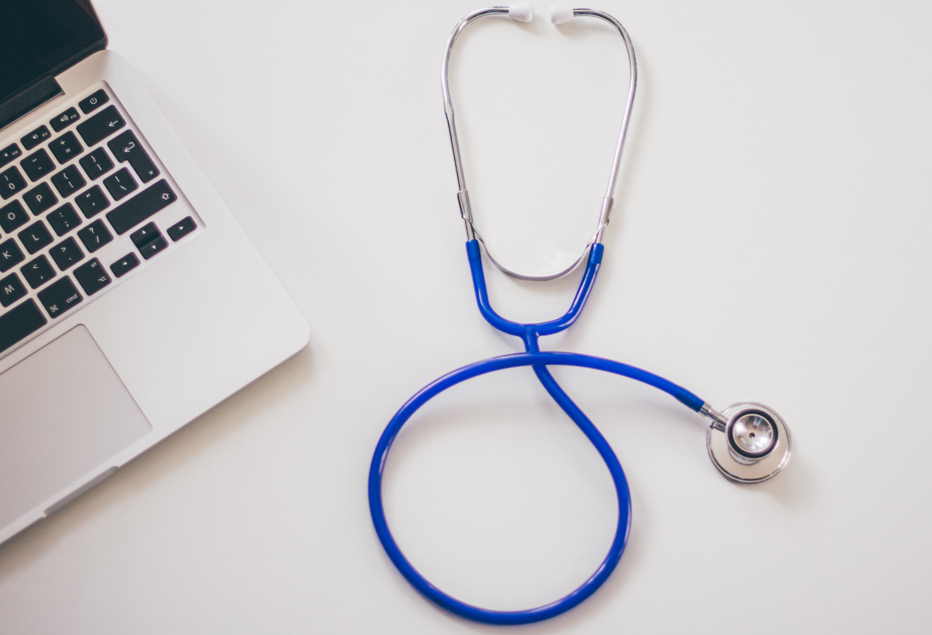
Deliver an easy and smart digital healthcare experience for the medical practitioners, so they can analyse and assess patient’s health patterns before and after surgery.
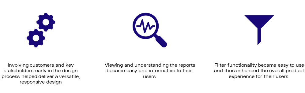
One of the goals: Improve usability of reports and filter functions for all users.
Created a roadmap that highlights various activities to be done for each feature in a meaningful sequence.
As a user, I want to view dashboard that visualizes a large data set and apply filter parameters on it, so that I can compare data, analyze and improve surgery procedure for our patients.

This was a large functionality and had to be further broken down -
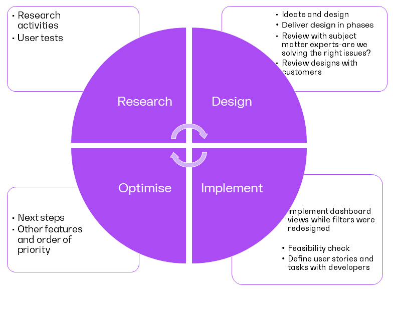
Design Process
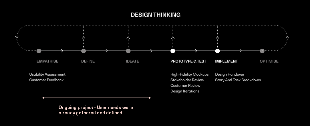

Prototype & Test
Designs were reviewed with experts during ideation and with customer for the final design. Few Review Comments
Implement
Design handover to developers
Design Process
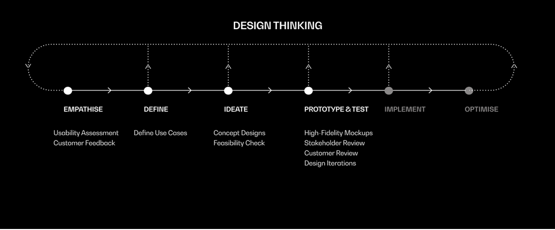
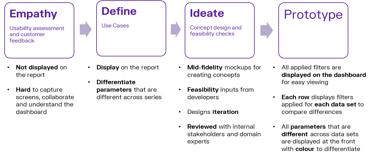
There were 3 aspects of filter function that had to be considered - Quick filters for easy and simple filtering, advanced filters for complex filtering and ability to display applied filters
QUICK FILTER
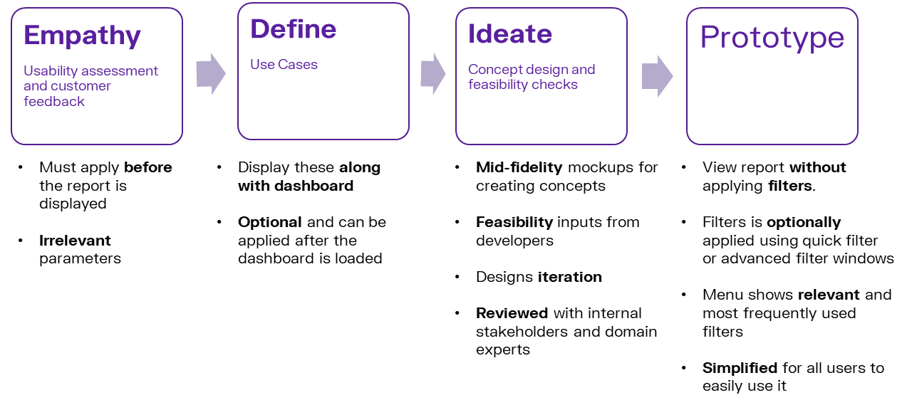
ADVANCED FILTER
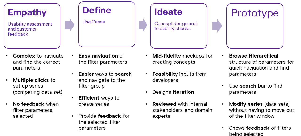
ACTIVE FILTER
Prototype & Test
INTERACTIVE MOCKUPS
REVIEW
Designs were reviewed with experts during ideation and with customer for the final design. Few Review Comments
Outcome
Gold Digger is a 2 player game that is meant to be left running. Gold digger collects gold where as his robo-pet is his radar. The view follows one player, robo-pet. The 2 players should work cooperatively to complete the game. Players lose the game if robo-pet runs out of battery.
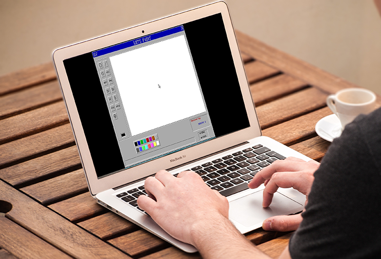
Close Project“Let’s Paint” is a 2D graphical editor package - developed using C language - which facilitates the user to draw simple geometric shapes. The user interface is easy to use, thus making the experience of painting fun.
This was an independent project developed by me. I have implemented basic graphic algorithms to draw 2 dimensional shapes.
Close Project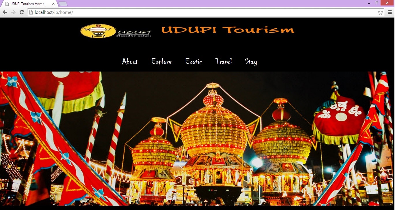
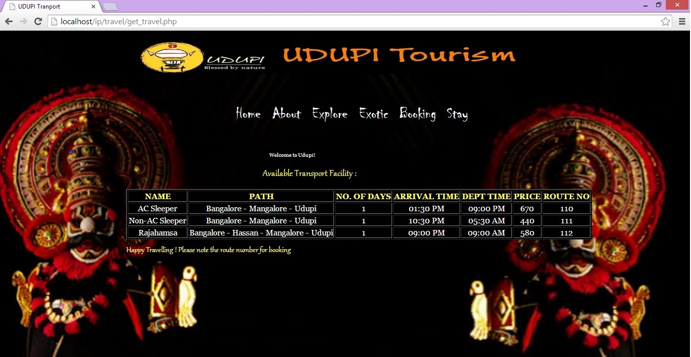
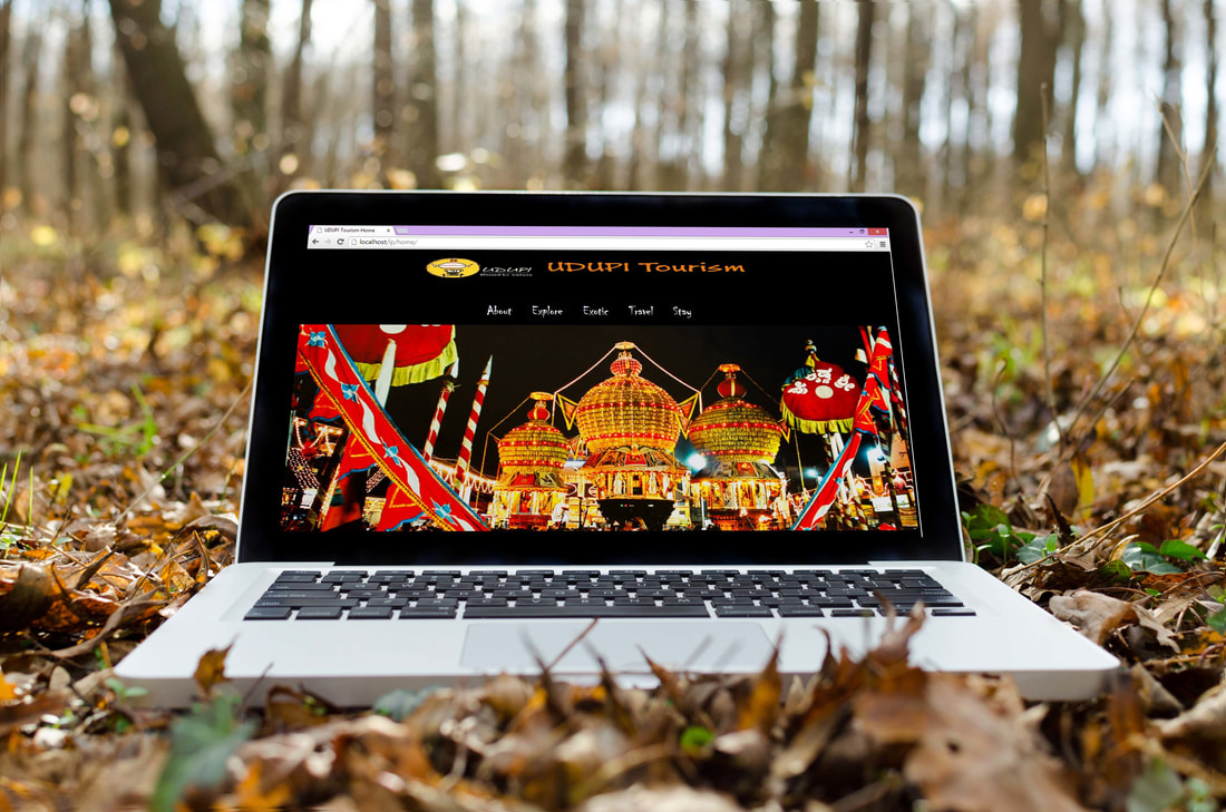
Udupi Tourism is a travel website that is a complete guide to Udupi city in India. Travelers can use this site to explore tourist places, local cuisine, hotels and lodges.
This was an independent project developed by me. I have implemented this website using HTML, CSS, JavaScript, PHP. I have also designed and created a database, and using SQL to query data.
Close Project